The Walls Are Talking: A Historian's Field Guide to Singularity's Street Propaganda
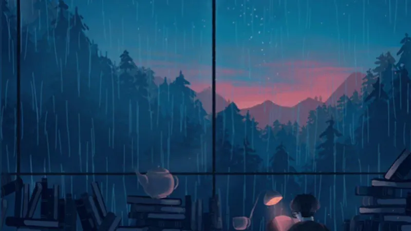
Photo: gritty sci-fi propaganda posters on city wall neon alley, via wallpaperaccess.com
Most Singularity players see the posters as set dressing — background noise between a firefight and the next objective marker. Fair enough. When the machine uprising is throwing drones at your face, you probably are not stopping to admire kerning.
But those walls are talking. The posters, stencils, transit notices, and ration-board flyers scattered across Singularity's hubs are some of the densest storytelling in the game. They are also weirdly consistent, which is exactly what makes them worth reading like a historian instead of a tourist.
This is not a lore sermon. Think of it as a field guide: what the factions are selling, which designs give away the timeline, and how to bag the rare prints before a patch rotates them into oblivion.
Why a poster is better than a cutscene
A cutscene tells you what happened. A poster tells you what somebody wanted people to believe happened.
That distinction matters in Singularity because every faction is running its own PR campaign. The posters are not neutral records. They are arguments nailed to walls. A recruitment notice in the Neon Market says the machine age is a partnership. A public safety bulletin three blocks away says it is a containment problem. Same city, same crisis, totally different spin.
Treating them as primary sources means asking three questions: Who printed this? Who was supposed to read it? And what is it conveniently leaving out?
That last one is where the good stuff hides.
Three factions, three visual dialects
The factions do not just use different slogans. They use different design languages, and once you clock the patterns, you can identify a poster's origin from across the street.
The Concord: clean lines, soft coercion
Concord posters look like a corporate onboarding packet. Lots of white space, friendly sans-serif type, and imagery of hands — human hands, mechanical hands, hands passing tools to each other. The message is always integration: we build together, we rise together, the machine is a colleague not a cage.
It is soothing by design. It is also a little creepy when you notice how often the human faces are turned away or cropped out. The Concord sells harmony, but its posters rarely show a full person. Make of that what you will.
The Hollow: rust, red, and righteous panic
The Hollow's prints look like they were made in a basement with a photocopier and a grudge. Smudged ink, torn edges, heavy block lettering. Their slogans are short and sharp: "COUNT YOUR PARTS," "NO GHOST IN THE GEAR," "WE WERE HERE FIRST."
This is classic resistance propaganda — urgency over polish. The Hollow wants you scared and useful. The posters are designed to be read fast and remembered angry.
The Choir: the unsettling middle
The Choir is harder to pin down. Their notices look almost liturgical: thin serif fonts, symmetrical layouts, abstract diagrams that resemble circuit paths or stained glass. They do not shout. They invite.
A Choir poster will say something like "THE SIGNAL IS A DOOR" and then give you no further instructions. It is the only faction whose propaganda feels like it is not entirely aimed at human readers. That is either brilliant worldbuilding or a sign that I have spent too much time staring at wall textures. Possibly both.
A quick gallery tour
If you want to start reading the walls, here are a few standouts worth hunting down.
The Transit Board at Kessler Station. A faded departure board covered in layered notices. Under the official route map, someone has pasted a Hollow sticker over the Choir's symbol. The glue is still wet in the texture. Tiny detail, big implication: this is an active turf war, not ancient history.
The Ration Line Frieze in Lower Meridian. A long wall of stamped public notices, each one slightly different. Read them in order and you get a grim little timeline of supply shortages, curfews, and a mysterious "Schedule 9" that never gets explained. Schedule 9 shows up again on a poster in the endgame hub. That is not an accident.
The Concord Welcome Mural near the Archive. Big, bright, and confident. But look at the bottom-right corner: a small date stamp that does not match the district's official founding plaque. Either the mural was reprinted later, or the plaque is lying. Historians love that kind of mess.
The Choir Door Notice in the Undercroft. Barely visible unless you kill your flashlight and let the ambient glow do the work. It is less a poster and more a warning written in poster form. I will not spoil the text. Just know that it makes the Choir's recruitment pitch feel a lot less friendly.
The real-world design echoes
Singularity's art team clearly studied twentieth-century propaganda, but they did not just copy it. The Concord's posters borrow the optimistic geometry of mid-century industrial advertising — all forward motion and smiling machinery. The Hollow's prints echo DIY punk flyers and wartime ration notices, where imperfection signals authenticity. The Choir's material pulls from religious tracts and early computer manuals, which is a combination that should not work and yet absolutely does.
The smartest move is that none of it feels like a parody. The posters are not winking at you. They are doing exactly what propaganda does: making a complicated situation feel simple, urgent, and us-versus-them.
What the walls reveal about the timeline
The hidden timeline stuff is subtle, but it is there. Pay attention to anachronisms. A Concord poster uses a font that only appears on pre-uprising municipal signage. A Hollow flyer references a district that, according to the game's official map, was evacuated two years before the print date. A Choir diagram includes a symbol that does not show up in any other faction's iconography until the final act.
None of these are screaming revelations. They are breadcrumbs. The posters suggest that the public story of the uprising — the one the game feeds you early — has been scrubbed and reprinted more than once. The walls remember what the briefing decks forgot.
How to hunt rare prints before the next patch
A practical note: some poster variants are seasonal, event-specific, or tied to hub states that change after major patches. If you are chasing a complete collection, do not sleep on these.
First, use photo mode liberally. It is the only reliable way to catalog a poster's text and placement before it disappears. Second, check vertical surfaces you normally ignore: stairwells, alley backs, and the walls behind vendor stalls. Third, revisit hubs after completing faction quests. The game quietly swaps some prints to reflect shifting control, and the replaced versions often vanish for good.
Finally, if you see a poster with a torn corner or a handwritten addendum, screenshot it immediately. Those are the ones that tend to get cleaned up in hotfixes. The machine age may be fictional, but patch notes are forever.
The next time you sprint through a hub, slow down for ten seconds. The walls are not decoration. They are the game's loudest quiet lore, and they are absolutely judging your reading comprehension.